Travel Adventures.
A senior product design challenge for a time travel startup app, enhancing the end-user experience to increase partner travel sales through intuitive browsing, detailed itineraries, and seamless booking. I designed a user flow, high-fidelity screens, and an optional prototype within the challenge’s constraints.
This showcases my ability to create functional, user-friendly navigation, solves the problem of unclear app structure, and highlights my prototyping skills, making it compelling for potential employers or clients.


Context.
-

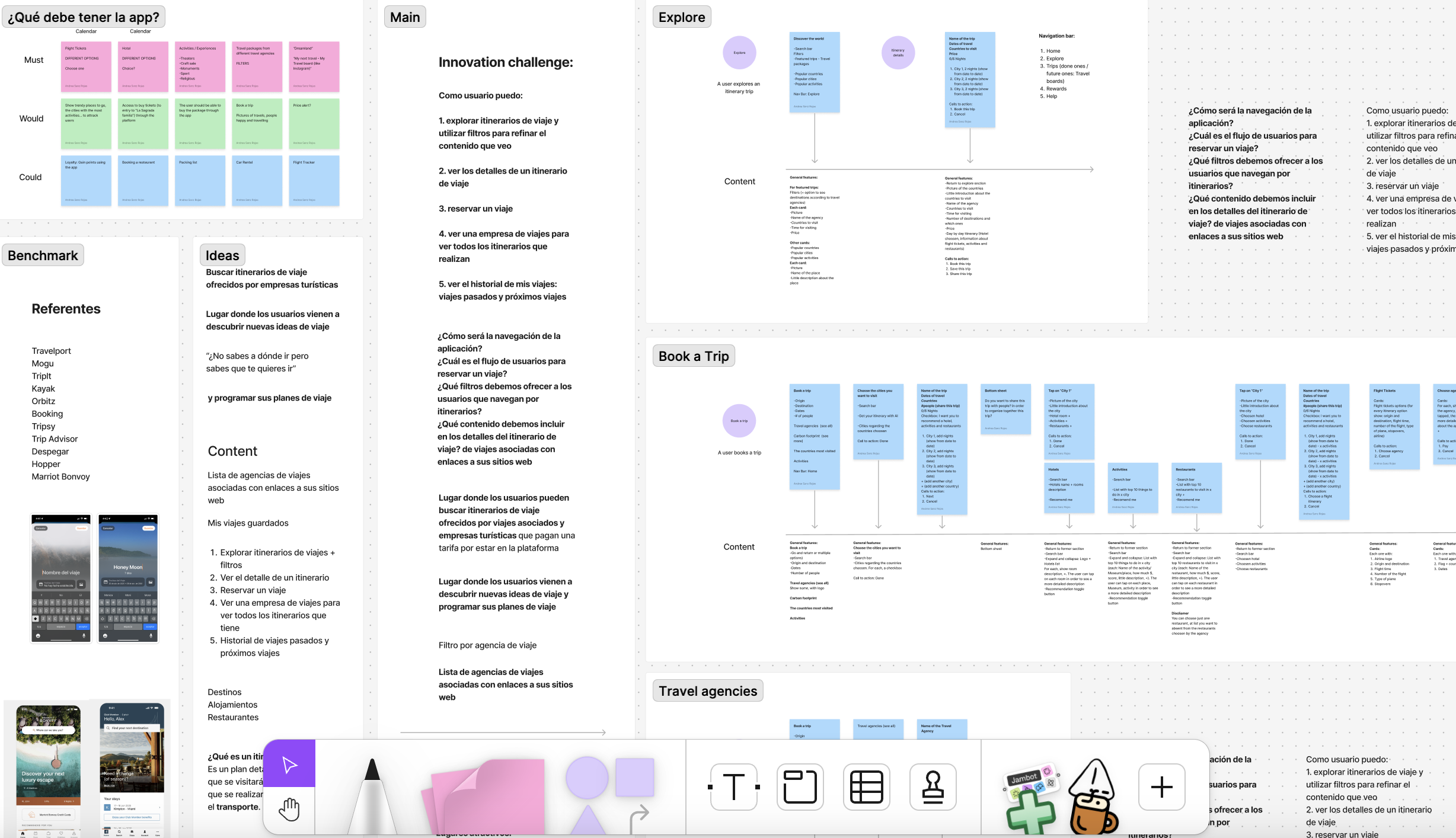
I worked on a design challenge for a time travel adventure startup aiming to create an app where users discover and book unique past and future travel itineraries from partner agencies. The goal was to enhance the end-user experience to increase sales for partners, building on an MVP that proved product-market fit. This project required a user flow or wireframes, 2–4 high-fidelity screens, and an optional prototype, completed without login/onboarding or account management.
-

Problems I Was Trying to Solve.
I needed to address challenges like unclear navigation, difficulty finding relevant itineraries, complex booking processes, and lack of trust in itinerary details, ensuring the app was intuitive, efficient, and drove partner sales for the MVP pilot launching in 4 months.
Research and Discovery
I’ve conducted user research, a persona like ‘Adventurous Explorer Alex,’ a 30–45-year-old traveler who loves unique experiences, values time efficiency, and uses apps to discover historical or futuristic trips. Insights revealed users struggle with narrowing itineraries, need detailed content, and want seamless booking. I also considered business goals, like increasing partner revenue and ensuring scalability for the pilot.
How I arrived at the solution?.
How I arrived at the solution?.

Results & Impact.
The design increases partner sales by enhancing user engagement, meets all challenge requirements, and showcases user flows, and visual design. It’s scalable for future features like advanced filters or trip management, ensuring long-term value for the startup.

Tools & Process
I used Figma for high-fidelity screens, design system, and prototyping.
I started by defining the app’s navigation—a bottom bar with ‘Home,’ ‘Discover,’ ‘Trips,’ and ‘Rewards’ tabs—based on Alex’s preference for intuitive, thumb-accessible navigation. I created a user flow to map the booking process, addressing edge cases like unavailable trips or payment errors. Using insights, I decided on filters (time period, location, cost, duration, type) and itinerary details (images, descriptions, costs, inclusions). I wireframed layouts to test usability, then designed a design system for consistency. Finally, I built high-fidelity screens iterating to ensure clarity, efficiency, and visual appeal.

Solution.


This project is a cornerstone of my portfolio because it highlights my end-to-end product design process—research, planning, UX, UI, and prototyping—under pressure.


